A short delineation for those who are not familiar with the astrological symbolism.
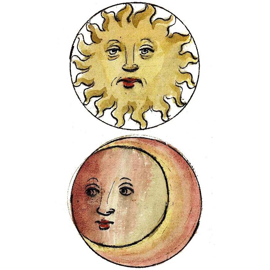
 The stylised letter “g” in my logo consists of two astrological symbols (or more often called glyphs): of the Sun (the circle with a dot in the middle) and the Moon (I’m sure the crescent is recognizable). Both these two are called the Lights or Luminaries [of the horoscope or sky]. They carry a special class name, due to being much brighter and much bigger in the sky then other planets.
(Side note: Wait, “planets”?! That’s right. In the past time a term derived from the Greek word planeton described a shiny object that is moving across the sky on the backdrop of the stars. And in astrology this meaning of the term “planet” holds on. That’s a distinctively different concept than the current astronomical one, which is much more complicated and had changed several times for example in the case of Pluto being downgraded from “planet” to a “dwarf planet” lately).
In my own natal chart (the scheme of the skies casted for the minute and place of one’s birth) I have a Moon up in the Sky and the Sun on the bottom. Though, archetypally the Sun rejoices when is rather visible up in the sky, and the Moon when is in the bottom part of the chart, that is de facto underground. (This is a big simplification of traditional rules, but I don’t intend to scare anyone with technicalities here).
The symbol of the Moon is known to basically everyone.
However for the symbol of the Sun that’s not necessarily so. It appears for instance in the botanic atlas to depict the annual plant, because the relation of the Earth to the Sun creates a year-cycle.
In the alchemy the Sun and Moon represent the royal metals: Sun – gold, and Moon – silver. Not hard to imagine why, when we look at these two Luminaries in the sky.
On the whole in astrology the Sun is the king’s counterpart and the Moon – the queen or mother’s.
Day and night. Pride and sacrifice. Ceremonial and emotionality. Male and female traits. Self-assertion and passivity (receptiveness). Two primary antitheses. Like the Chinese yin (Moon) and yang (Sun).
It’s hard to coin a logo that would capture my relationship with the astrology (and design as well) more. Without the triumph of form over substance, not striping the symbols of the depth within its archetypal mysticism.

Leave A Comment